I started to write this piece in part to escape from the events of November 6, 2024, but I think it's grown into something else.
It was and is a reflection on the time I spent in London during what felt like the first true week of winter; but, as I wrote it, I felt I was committed to a particular kind of practice, one part aesthetic, another political, and some other part somehow spiritual.
I was reminded, at times, of Rebecca Solnit, who writes about getting lost and wandering with a poetry that I do not expect to ever achieve. I'm not a poet; I deal in prose, bad and sometimes good, for better and for worse. While Solnit's incitement to get lost sometimes resonates, the practice I felt myself amidst in London and afterward was different.
I've always rejected the idea of travel as an "escape." Whether from our daily lives, our work, or our national politics (gulp), an escape implies, firstly, something that is, or we wish to be, permanent – through this lens, to return from vacation is, in some sense, a failure. But beyond anything, there's a particular kind of naïveté that it takes to believe that only being in a new or just different place will make our lives better.
I'm reminded of the Europeans who came to what we now call Banff, searching for fresh air and, implicitly, an escape from the harshness of urban living in the 19th century. A lucky few would make new homes, and transform their lives, but most would return home to the grind, with only a precious few deciding that it was where they lived that needed to change, not just be escaped from.
And so it was with this triple spirit of leisure, curiosity, and improvement that I set out in London.
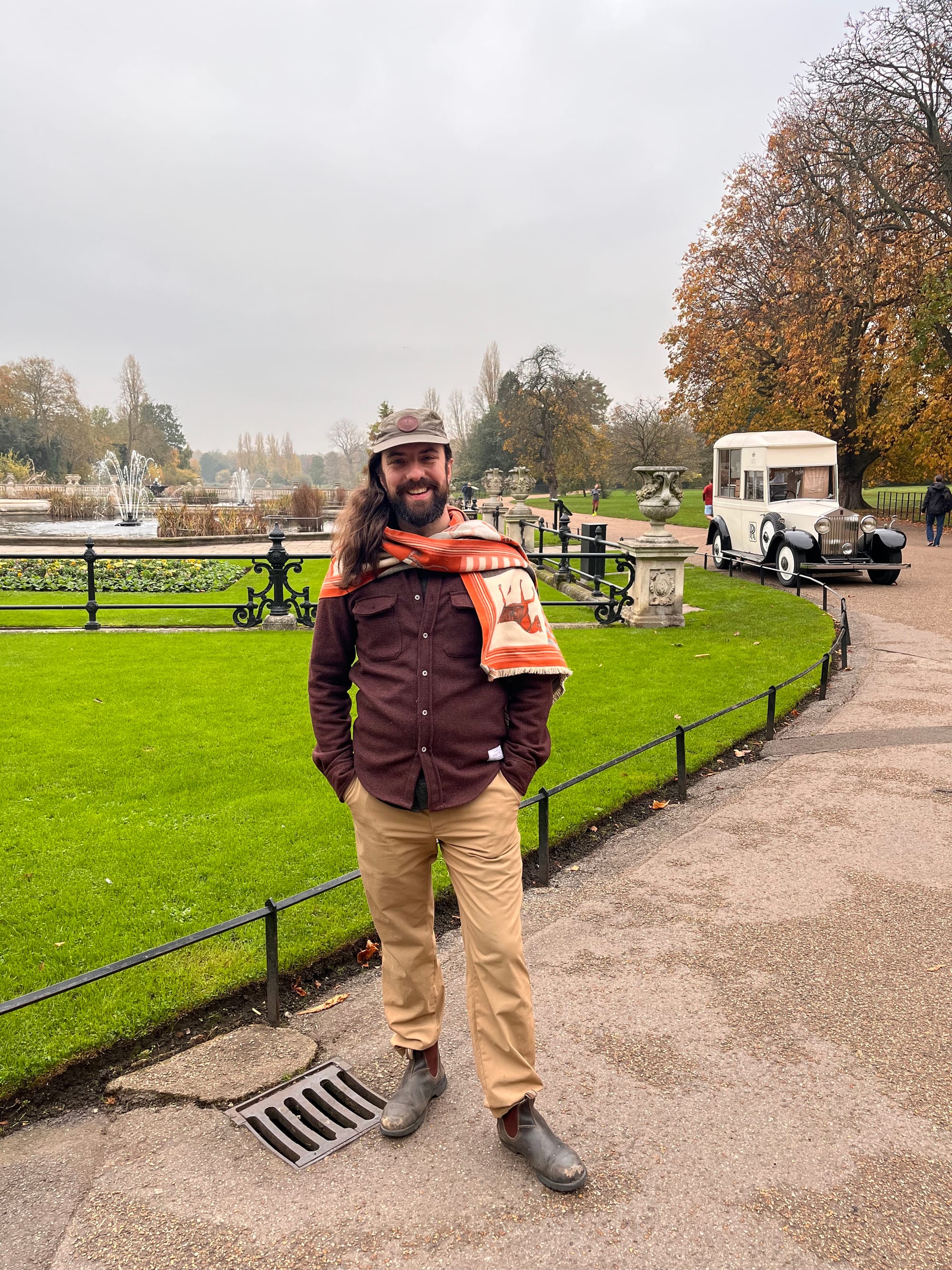
I stayed with my cousin who lives in the – by her own description – bougie neighbourhood around the Maida Vale station on the Bakerloo line.
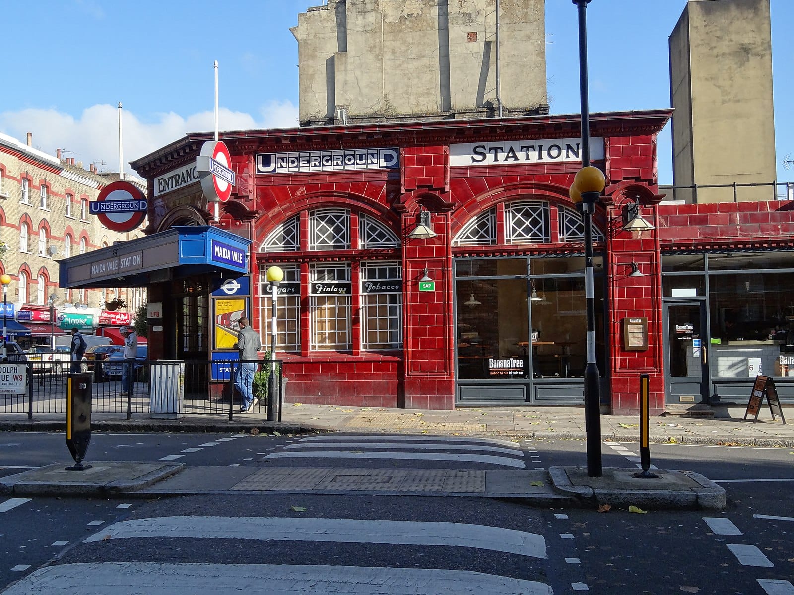
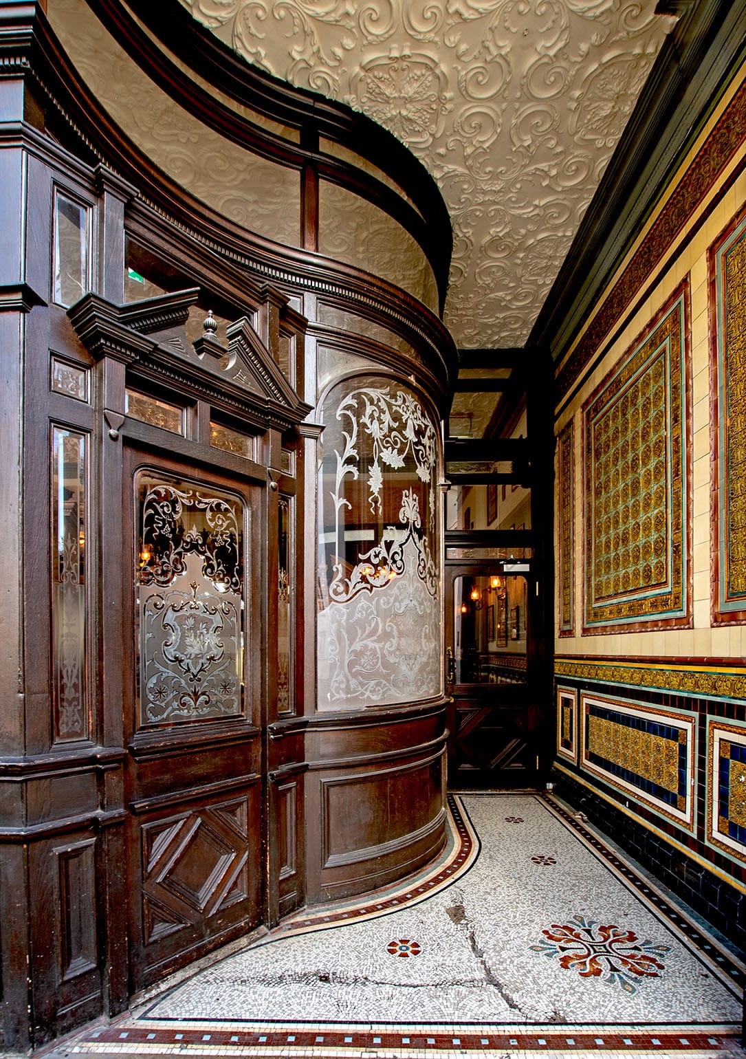
There are a bunch of "Grade II" heritage buildings around the area, including the station itself, but it was the Prince Alfred pub that really drew me in. It is one of a handful of remaining institutions in the UK that still have "snob screens," which were usually etched-glass dividers to separate the poor from the wealthy.
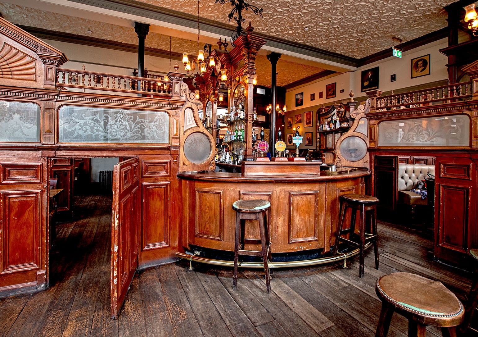
The tile-work and glass etchings throughout the building were simply stunning. After over 170 years, the building still feels lovingly maintained (probably due to its heritage status).
Part of what struck me on the way in, beyond the glass etchings, was the tilework for the entrance. The entrance wall is arranged in concentric squares and rectangles, guarded by what felt to me like homages to what the Greeks called a meander (Μαίανδρος).
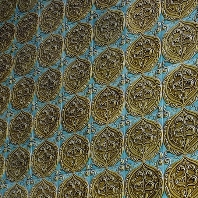
The tiles themselves were gorgeous ceramic works. The colour scheme feels Persian-inspired to me, with deeply Victorian stylizations on the interior.
Around this time I was reading Material Culture, Material Reform, a brilliant little missive about the materiality of buildings and how far and wide our supply chains for what we use in buildings have come.
 Material Cultures
If you work in the circular economy, or even just climate change more generally, I highly recommend the challenging perspectives about supply chains that the book represents. I'm not entirely convinced by some of the re-localization arguments made – particularly in light of the speed with which we need to build more housing and certain infrastructure to respond to climate change. Still, the critique it presents is powerful and one we need to have real answers for.
As I saw materials and artifacts like this, I was always in dialogue with myself about where the physical materials came from and in what ways both the culture and materiality of that item was tied up in British imperialism. Naturally, this latter consideration came up a lot.
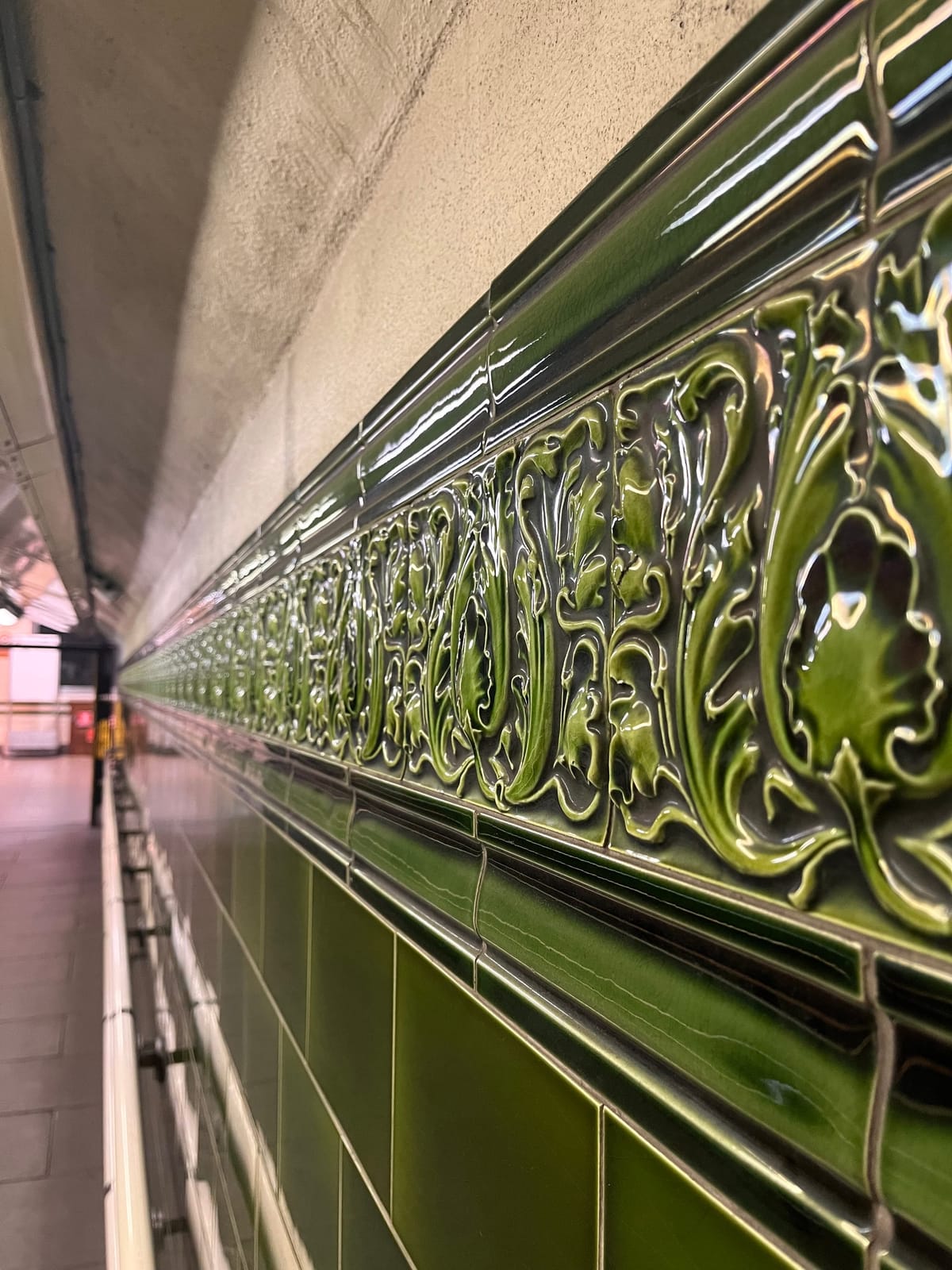
Because I'm an urban planner at heart and very much a strap-hanging transit rider, I spent a lot of time on the Tube and buses in the City, and I was continuously impressed by the care and craftsmanship that went into the earlier underground stations. Because I was staying at Maida Vale, I spent a good deal of time on the Bakerloo line, which gave me the chance to see the tiles in the Regent's Park Station.

Because of their prominence, I was actually able to find a little bit about the detailing on these stunning pieces. They were created by Edwardian architect and designer Leslie William Green, who, despite being somewhat eclipsed by later Underground architect Charles Holden, is notable for developing a distinctly British art nouveau style that remains profoundly popular to this day.
Green apparently pioneered both a construction approach – using structural steel frame techniques newly imported from the US – as well as a decorative style with the tilework. These tiles all came from a local British manufacturer based in Leeds: Burmantofts Pottery.
These tiles are, as I understand it, a form of glazed terracotta. The "fire clay" found in an older coal mine near Leeds became the principal material input for a profusion of both mass-produced and more expensive, bespoke designs. As far as I can tell, these would have been "dust-pressed" tiles, made from dust clay in tile presses, with their moulded reliefs. The tiles are so popular that modern recreations are now mass-produced for bougie interiors in London and beyond.
The Beauty of Transport writer Daniel Wright does a beautiful feature on Green which I highly recommend.
 The Beauty of Transportdwtransportwriting
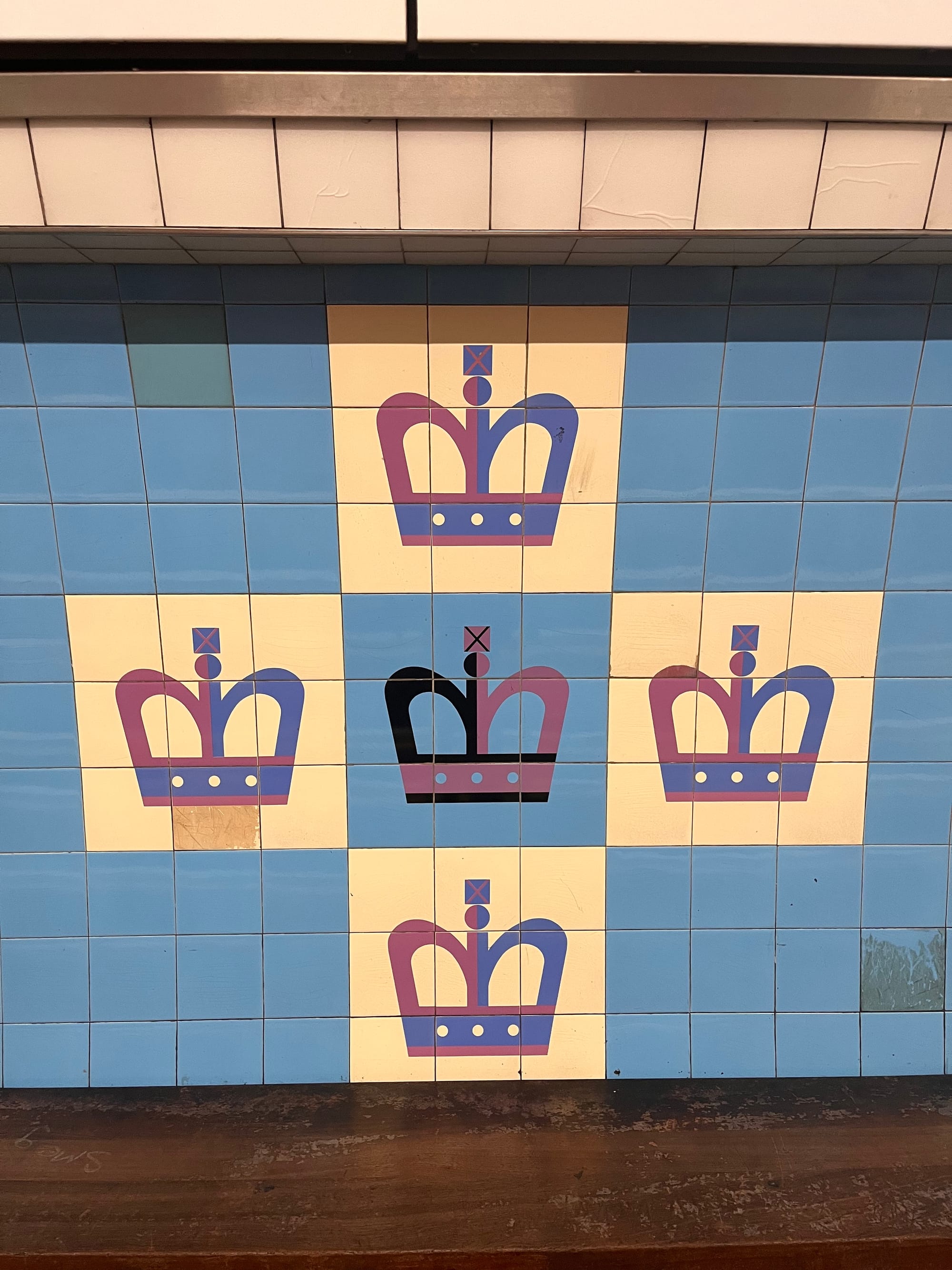
Tiles were on the mind, I suppose, for much of my trip, because after drinking in the beauty of Green's work on the Bakerlooo line, I also found myself enjoying the more modernist themes of the Victoria Line's King's Cross St Pancras Station.
I've always lovingly admired metros that take an ideographic approach to station design. When you arrive at King's Cross Station, you look out the window and, even to a casual user, the imagery tells you where you are quite readily:
I think I first encountered this in Hong Kong, where the Metro Transit Railway (MTR) system's first chief architect, Roland Paoloetti, was responsible for giving each station its own distinctive, tile-encrusted personality and colour. Given Paoletti's training at the University of Manchester in the 1940s and 1950s, it doesn't strain credulity to think that he was inspired by Green's work back in London. (Paoletti did eventually leave his mark on London in the 1990s, but his work on the Jubilee extension doesn't have this same kind of joy).

Living in Vancouver, where our penny-pinching mindset on station design always demands drab grays and whites, these colours are an incredible breath of fresh air.

If we looked at the transit experience holistically, I think we'd find that a little joy brought into station design would undoubtedly be a boon to people jumping on lines (though, to be clear, let's work on frequency and reliability first).
Jumping on and off at King's Cross St Pancras was extremely convenient for getting to one of the spaces I was most excited to see the British Library.
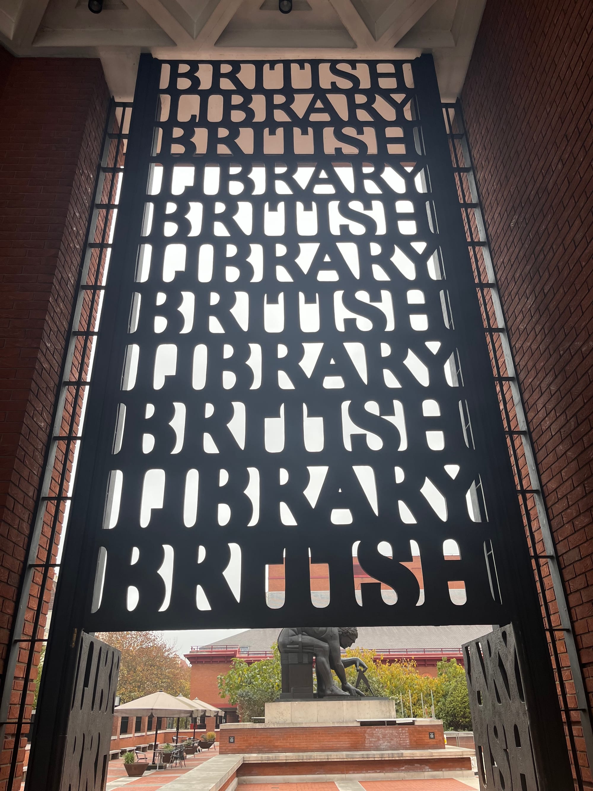
The gate was designed by Lida Lopes Cardozo Kindersley and her husband David, both famous typesetters from the UK who effectively snuck into the gate design process after working on the design for the library's main entrance sign. As this charming blog from the Library describes:
Made up of seven pieces, with two opening leaves, the striking gates incorporate a repetition of the words ‘British Library’ that are heavy and bold at the bottom and get lighter towards the top. Not only were the letters carefully measured to prevent children from getting their heads stuck in the gaps, but the clever design means that sunlight shines through and projects a wonderful shadow of the words onto the surrounding wall. Cast in bronze, the gates weigh an incredible three tonnes – a vast crane was needed for the installation.
As if this gate wasn't charming enough, immediately after this, you encounter the 12-foot bronze, vaguely cubist statue of Sir Isaac Newton, stripped down to his bare essentials, measuring with fixation something on the floor.
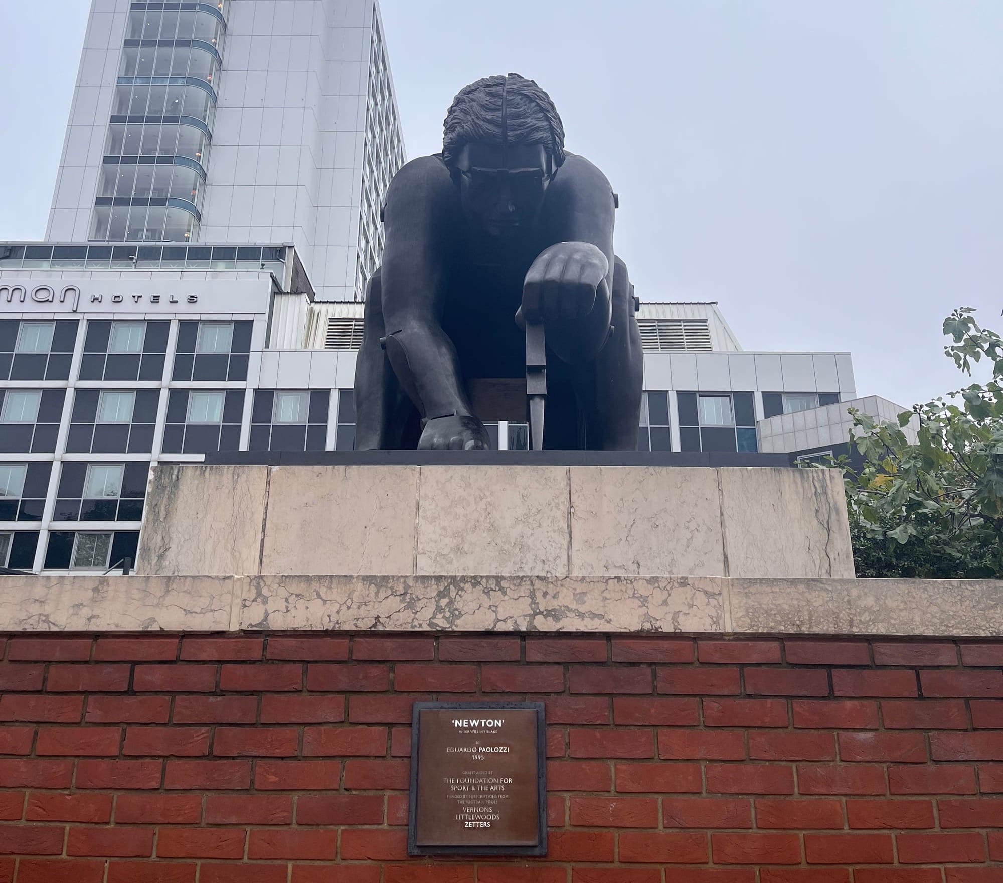
The statue is actually based on a William Blake watercolour, "Newton: Portrait of a Man Limited by Reason," showing him in almost the same pose.
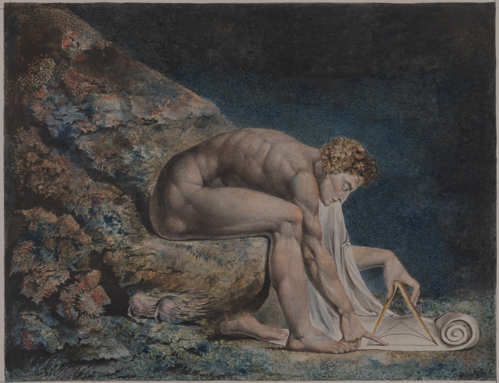
The symbolism of both the pose and the activity are fascinating, and the notes from the Tate express some of the complexity of interpretation:
The design was also developed from plate 10 of the second issue of There is no Natural Religion [a work of Blake's about philosophy and senses] , which shows an old man kneeling on the ground and drawing with a pair of compasses to illustrate the text: "Application. He who sees the Infinite in all things sees God. He who sees the Ratio only sees himself only’"
As Wikipedia helpfully contextualizes further, There is No Natural Religion is a contested work of Blake's (possibly one or two distinct, but deeply interrelated pieces), including its companion, All Religions are One. It (or they) however, are generally agreed upon as a statement of Blake's beliefs on 18th-century debates on the nature of experience and how that related to Newton, Francis Bacon, and John Locke's understanding of how both rationality generally, and empiricism specifically, work.
As poetry scholar Alicia Ostriker interprets, No Natural Religion is a "mockery of rationalism and an insistence on Man's potential infinitude."
Despite a size, prominence, and attention to detail that suggests an appreciation of, or perhaps simply a respect, for Newton, both the title of the statue "Newton After Blake" and its form are suggestive of a different perspective. Paolozzi not only mirrors Blake's posture from the plate in There is No Natural Religion, but goes even further: this Newton is blocky, angular, and riven with the kind of linear segmentation and almost mechanical bodily outgrowths, suggestive of a kind of inhumanity.

The more I learned about the statue and its politics, the more I loved it and the provocative role it plays in getting people to consider the role of a figure of Newton in the production (and contestation) of knowledge. I can't think of a more appropriate conversation for a library to spark.
I could write at length about the collection within the British Library itself, but for now, I'll just say that it is gorgeous, large, and, as I experienced with its small exhibit on historical queer writing, working to bring a more diverse array of voices into these formal spaces.
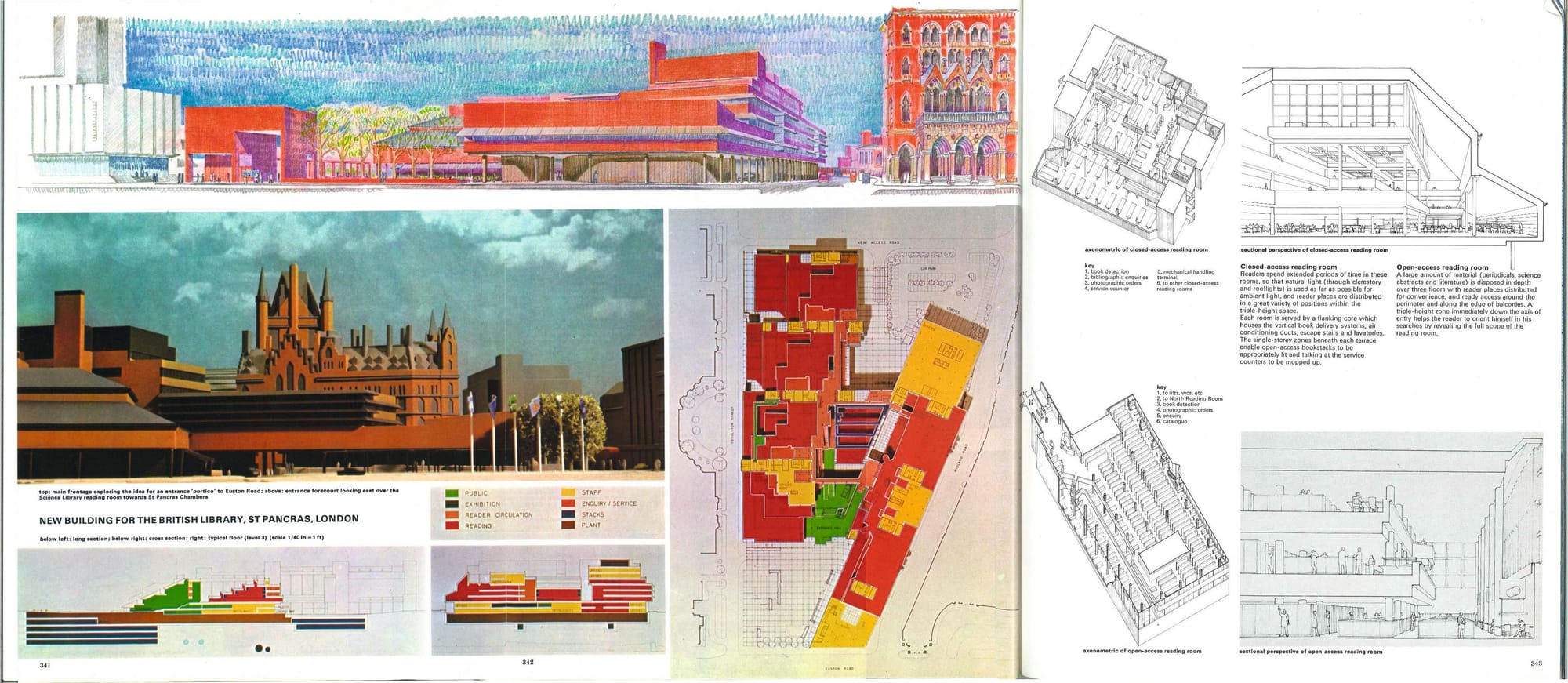
Later on in the trip, I literally stumbled into the Royal British Institute of Architecture and was thrilled to see a fascinating exhibit "Difficult Sites" that they were running. The descriptions of the complexity involved in developing the British Library (and its sadly unfinished original plan) were mind-boggling when you consider how its underground vault has to simultaneously navigate a thicket of underground infrastructure while also maintaining the safety of its immense collection.
The Royal Institute's 66 Portland Place site is an architectural treasure all unto itself.
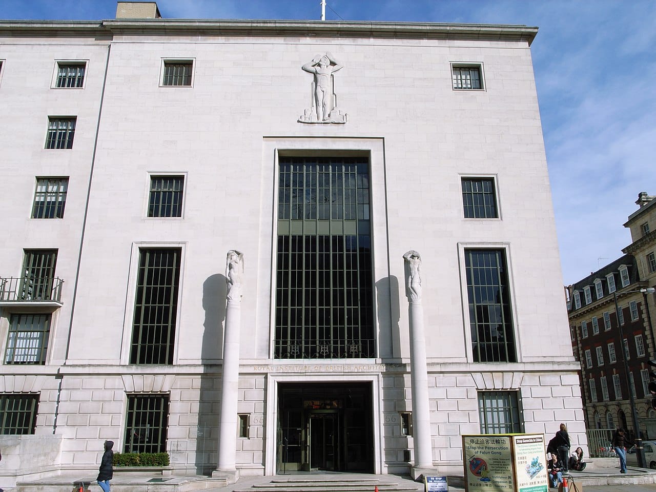
The Institute has a wonderful overview video of the site narrated by architectural historian Neal Shasore.
One of the lines I like most in the video, and which came to mind in different ways as I toured parts of the building, is that it is indeed a monument. As Shasore puts it, the George Grey Wornum-designed building is "designed by architects, for architects [and] is a monument to professionalization, for good or for ill, at a time when the modern profession of architecture was being forged ."
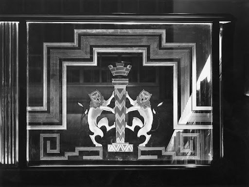
The whole building is replete with fascinating details. Easily my favourite were the "thin" version of lions from the RIBA logo, creatively woven into many of the building's fixtures and ornaments.
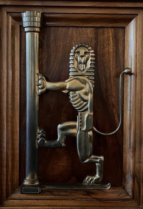
Google Arts and Culture, surprisingly, does a pretty fantastic job of touring the building and pulling out highlights.
 Google Arts & Culture
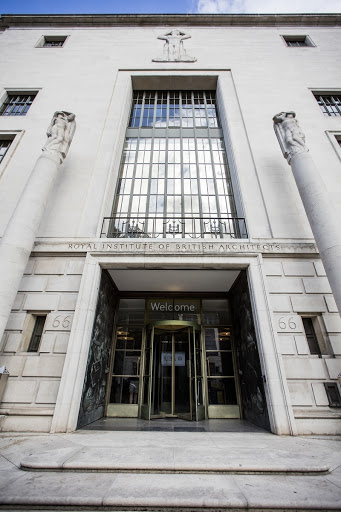
Even more interesting, however, than the general tour, is the coverage of 66 Portland Place's (and RIBA's more generally) role in British Imperialism.
There are innumerable ways in which empire is valorized throughout the building, but there is clearly an attempt (however sincere, I cannot say) to grapple with that past. As they quote the 2024 RIBA President, Muyiwa Oki "We cannot change the past, but we do have a responsibility to understand and learn from it."
 Google Arts & Culture
My final bit of wandering brought me to the brutalist masterpiece, the Brunswick Centre.
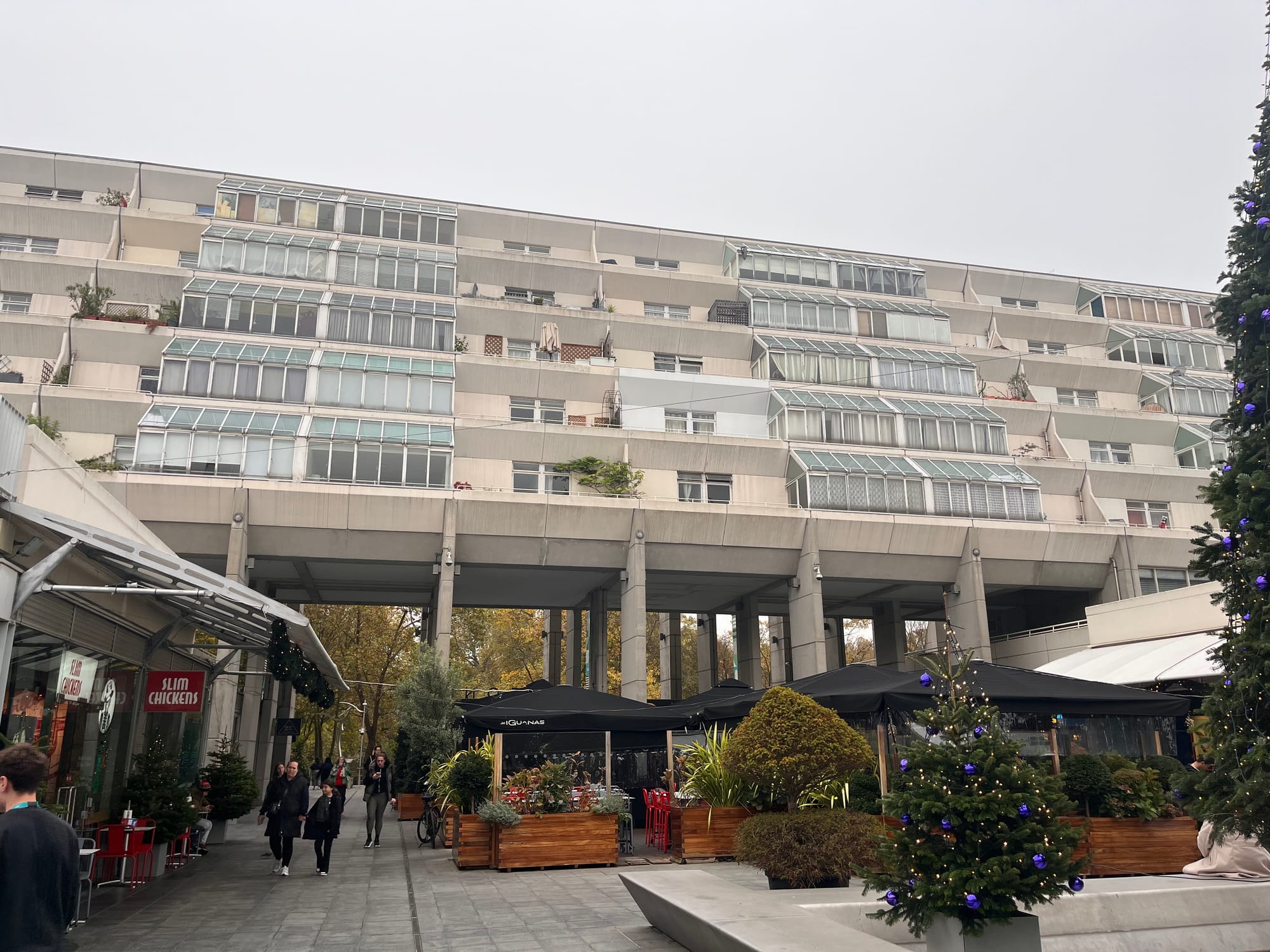
At first, I thought it was the Alexandra Road Estate (also known as Rowley Way) designed by the now-celebrated Sir Neave Brown. But this other ziggurat-style modernist piece was created by Leslie Martin and Patrick Hodgkinson.
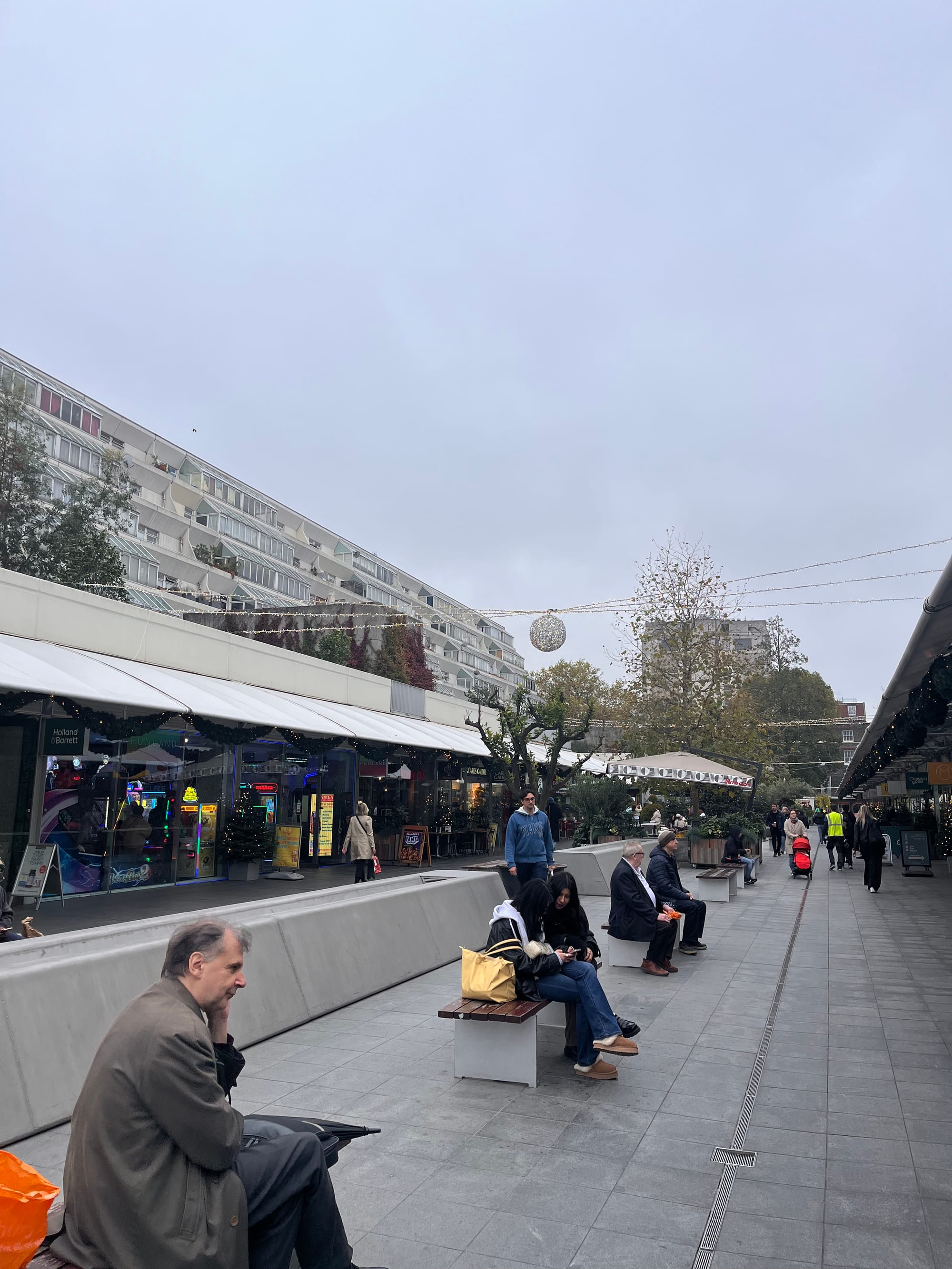
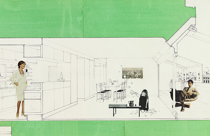
Located within the fairly posh Bloomsbury area of Camden, I learned that despite what I would have thought of it being a publicly owned council estate, it is in fact a rare private mixed-use development from the 1960s. Fascinatingly, and in seeming counter-point to many similar buildings, the local council has actually leased units within the building since the 1970s, rather than falling prey to the wave of privatization led by Margaret Thatcher that saw public housing units sold off one-by-one.
 The GuardianAndy Beckett
Like many modernist pieces of this time, its grand ambitions were never fully realized, but the emphasis on brightness and open-air access in the units still feels sadly unique and made it a place I, and I'm sure many others, would readily want to live.
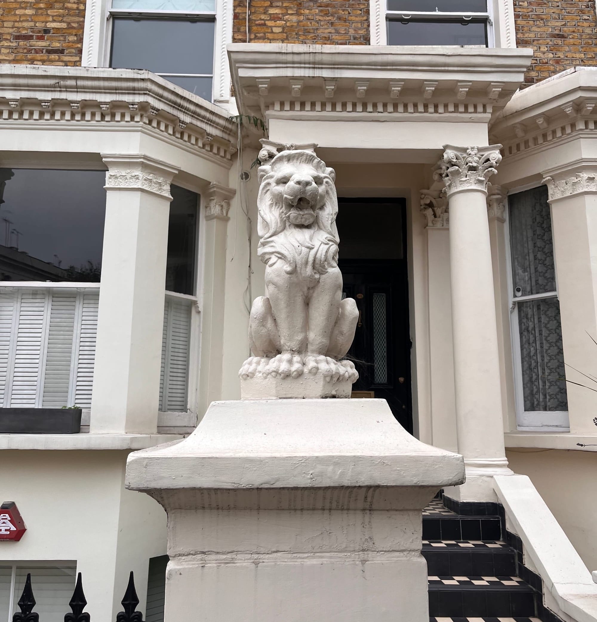
I moved through London with a spirit of curiosity, and the hope I might encounter things that I would learn from, and maybe even bring home with me. Perhaps it was the sheer size of the problems that orbited around me that pulled my gaze a little closer to the ground, but as I wrote this piece it was clear to me that it was the details, decorative and otherwise, that consistently drew my gaze.
I'll leave it to the architects and designers to litigate the finer points of decoration in our society, but I do feel confident in making one more general assertion:
Details, not just decoration, bring spaces and places alive. I was consistently reminded of this everywhere I turned in London. With its nearly two millennia history (to be celebrated sometime between 2047-2050) , London sometimes gets lost in its details, the innavigable alleyways and arcane fixtures illegible to most modern eyes.
Technology is both an ally and a spoiler here; my phone constantly wanted to pull me away from the here and now, and yet, as when I listened to Paul Cooper's brilliant history of Roman Britain, it also gave me so much more insight into where I was and how it all worked.
The immateriality of information that I took in, combined with the physicality of walking, breathing, smelling, and, even tasting (not always a desirable experience) London left me with a more fulsome picture of a place than I have had in some time. But it was the physicality of the details, whether through walking or touching, that undergirded the experience.
As I grapple ever more with the role of technology in mediating our environments, the devices we carry ever more designed to steal our attention, the details, those gloriously quotidian frictional interactions, were one of the only things that kept my feet grounded in the world. They expressed its beauty, they connected me to mine and others' culture, and they showed me (both in the moment and through later exploration) how it was possible to make change in the world.
I hope these details give you some ideas, too – and that looking for them around you will give you, too, a few moments to pause and take in the world around you.
Sign up for George Patrick Richard Benson
Strategist, writer, and researcher.
No spam. Unsubscribe anytime.
